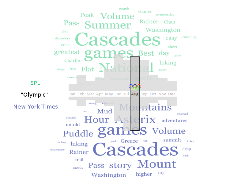
“Olympic” contexts: Seattle Public Library vs. The New York Times
MAT 259, 2014
Kitty Currier
Concept
The word “olympic”, like many words, can have multiple meanings. Natural language processing techniques such as sentiment analysis attempt to infer—through computation—meaning from text, but these techniques are complex to understand and apply properly. One relatively simple way to explore differences in how a term is used is to look at the words that accompany it and let the human brain infer the meanings. In this visualization I use word clouds to visualize the terms that accompany the term “olympic” in both SPL item and New York Times article titles. The visualization enables a viewer to explore how time of year and geography contribute to the context and use of the word.
I limit this visualization to the year 2008, a Summer Olympic Games year, and aggregate data by month. In the SPL dataset I select the title and check-out date for every item with the word “olympic" in its title. Items that are checked out more frequently will therefore be weighted more heavily. In the NYT dataset I select every article that contains the term “olympic" in its headline, and I create the word cloud from both the headline and abstract of the article. Including the abstract was necessary because in some months there are so few headlines with my search term that to construct a reasonably full word cloud required more text than the headline, alone, could provide.
I limit this visualization to the year 2008, a Summer Olympic Games year, and aggregate data by month. In the SPL dataset I select the title and check-out date for every item with the word “olympic" in its title. Items that are checked out more frequently will therefore be weighted more heavily. In the NYT dataset I select every article that contains the term “olympic" in its headline, and I create the word cloud from both the headline and abstract of the article. Including the abstract was necessary because in some months there are so few headlines with my search term that to construct a reasonably full word cloud required more text than the headline, alone, could provide.
Background
and Sketches
and Sketches
My original concept used a stacked bar graphic to represent the count of titles containing the word “olympic" (figure on following page). I wanted to compare several types of information across the SPL and NYT data sets: (1) the context of the word “olympic" as it appears in item and article titles; and (2) the relative popularity of titles and articles containing the term over the span of one year. To illustrate (1) chose a word cloud representation, where words appearing more frequently would appear larger. To illustrate (2), my original concept used a stacked bar graphic superimposed on the word clouds (see doodle, following). I later changed this so that color lightness represented the relative popularity (frequency) of titles containing the search term “Olympic" in both data sets.
Query
SQL queries:
SELECT month(o) AS month, title FROM activity, title WHERE activity.bib=title.bib AND title LIKE "%olympic%" AND year(o)=2008 ORDER BY month(o), title
Result: 3255 row(s) returned 41.793 sec / 12.292 sec
Output from this query is stored in the accompanying file olympic2008.csv. This query simply returns the title and check-out month of an item once for every time it was checked out during 2008. Items that were checked out more than once in a month appear multiple times in the data set so their words receive greater weight as the word clouds are constructed.
NYT query:
http://api.nytimes.com/svc/search/v2/articlesearch .json? fq=headline:olympic? &fl=headline,pub_date,abstract &p=0 &sort=oldest &begin_date=20080101 &end_date=20081231 &api-key=c9b4a5278dfe3aa89d66972eef4f847b:13:65477885
Result: 454 results were returned, requiring 46 query calls to the NYT API with 10 returned per call. All are saved as JSON files in the currier_proj3/wc_setup/data folder.
This query searches article headlines from the year 2008 that contain “olympic?” (where “?” is a wildcard so that both “olympic” and “olympics" are returned), and the results are sorted from oldest to newest. A for loop in the code iterates over 46 pages of results returned by the NYT API, as the API only returns 10 results per page.
Process
Instead of a bar chart I decided to represent the count of article/item titles using a light-dark color palette. The SPL data are in green, while the NYT data are in blue. I had to symbolize the results according to different scales, as the SPL counts varied relatively little from month to month, ranging from 183–422 hits, but the NYT results varied by orders of magnitude more, varying from 3–289 hits. I used a logarithmic transformation to assign color classes to the NYT data, while the SPL data were assigned through non-logarithmic normalization.
The word cloud words are sized and colored according to the number of times they appear in the data—larger, darker words appear more than smaller, lighter words. When a user hovers the mouse over a month, that month’s word clouds are displayed and the black box highlights the month’s data that are being displayed. I wrote two programs to create this visualization: wc_setup and draw. The first queries the NYT database; parses and saves the result as JSON files; parses the result of a saved query to the SPL database; and generates and saves 24 word cloud images as GIF files. The second program reads the data saved by the first and generates the visualization.
The word cloud words are sized and colored according to the number of times they appear in the data—larger, darker words appear more than smaller, lighter words. When a user hovers the mouse over a month, that month’s word clouds are displayed and the black box highlights the month’s data that are being displayed. I wrote two programs to create this visualization: wc_setup and draw. The first queries the NYT database; parses and saves the result as JSON files; parses the result of a saved query to the SPL database; and generates and saves 24 word cloud images as GIF files. The second program reads the data saved by the first and generates the visualization.
Final result
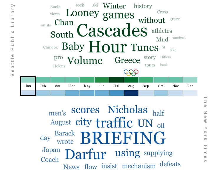
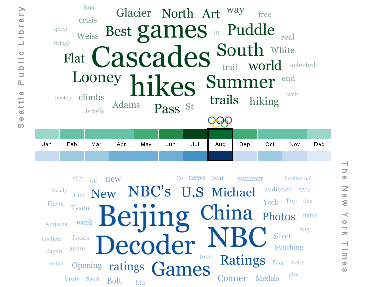
The NYT word clouds suggest that the Olympic Games or Olympics are the subject of the articles symbolized by the word clouds. The count of articles rises sharply in August, the month when the Olympics were held in Beijing. This contrasts with the SPL titles, which peak in July. Also, it is obvious that few articles were devoted to “olympic” themes during the winter months—January-Mar and Nov-Dec—both preceding and following the Olympic Games. The word clouds for these clouds are sadly sparse.
A few unexpected terms appear prominently in both the SPL and NYT word clouds. “Asterix”, for example, appears in several of the SPL word clouds, probably the result of a comic book. In the NYT data, terms like “DVD” and “Kristof” figure prominently. To delve into these would require a more versatile visualization, one that provided more information about the titles that contributed terms to the word clouds. It would be useful, for example, to be able to click on a word and see the original title where the word appeared. It was also interesting to note that the word cloud algorithm produces slightly different results each time it is run; on occasion terms that figure prominently after one run of the code are dropped after subsequent runs.
Code
I used Processing.
Control: Pointing the mouse at a different month causes the word clouds to change to reflect the data for that month.
Source Code
Control: Pointing the mouse at a different month causes the word clouds to change to reflect the data for that month.
Source Code