Exploring anomalies with SOM
MAT 259, 2014
Kitty Currier
Concept
In our data set a handful of library items—technically, item numbers—are associated with more than one bar code. As of this writing, 26,901 item numbers fall into this category, or about 0.8% of the total unique itemNumbers in the spl2 database. These are anomalies—according to metadata, each physical item should have one item number and one bar code. This visualization is an attempt to characterize this handful of anomalous items and reveal patterns that could suggest explanations as to why multiple bar codes may be associated with a single item number.
The breakdown of item number categories is as follows:
5 bar codes
4 bar codes
3 bar codes
2 bar codes
1
25
719
26,156
The variables I included in my final visualization are (a) the number of bar codes associated with each item number, (b) the number of times each item was checked out; and whether the item is a (c) book, (d) CD, or (e) DVD.
Background
and Sketches
and Sketches
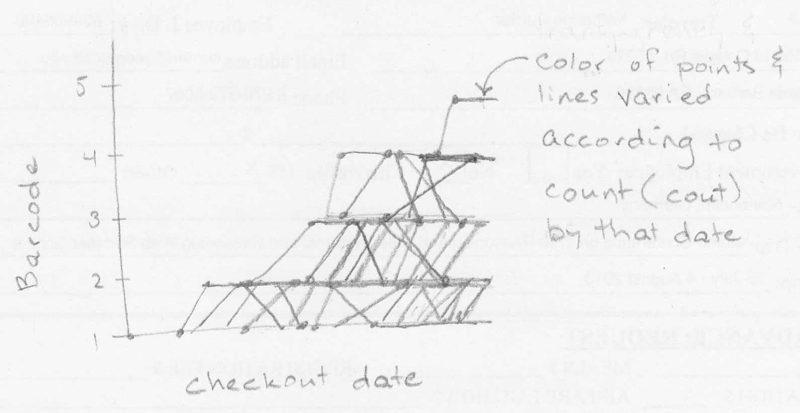
My original thought was to visualize the trajectory of individual item numbers through “bar code space”, plotting the check-out date (x-axis) against the total number of bar codes associated with each item by that date (y-axis).
Query
SELECT a1.itemNumber, numBarcodes, COUNT(inraw.cout) AS numCout, itemtype,
FROM
(SELECT itemnumber, COUNT(DISTINCT barcode) AS numBarcodes
Kitty Currier
MAT 259
6 February 2014
Revised 27 February 2014
Page 2 of 5
FROM inraw
GROUP BY itemNumber
ORDER BY numBarcodes
DESC LIMIT 26901) AS a1,
inraw
WHERE (inraw.itemNumber = a1.itemNumber)
GROUP BY a1.itemNumber
ORDER BY numBarcodes DESC
Output from this query is stored in the accompanying file 2014-01-27_queryresults.csv.
Data pre-processing:
This query produced approximately 27,000 records, from which I selected a tiny sample to visualize for my first foray into Processing. In Excel I selected 60 records (rows), with 20 having four barcodes each, 20 having three bar codes each, and 20 having two bar codes each. This arbitrary selection method ensured that I had representatives from three distinct bar code categories.
My Processing algorithm required that the data be normalized so that all values were between 0 and 1, so I used Excel to normalize the values in each column. The resulting file, testTable60.csv, is contained in the accompanying Processing project folder, along with a similar file containing 100 records for comparison.
Process
I abandoned my original idea in favor of a self-organizing map (SOM) visualization. The units being visualized are individual items, each characterized by three (to begin with) variables: (1) the associated number of bar codes: 2, 3, or 4; (2) the number of times the item has been checked out; and (3) the Boolean IS or IS NOT a book.
SOM algorithm
My code is based on a SOM algorithm written by Mike Goodwin (MAT 259 student in 2006?), found at http://www.mat.ucsb.edu/~g.legrady/academic/courses/06w259/projs/mg/KohonenSpectrum/. I also incorporated code for a Table class found in the Processing Examples > Books > Visualizing Data > ch03-usmap > step01_fig1_red_dots.pde. This class is useful for reading data from a comma- or tab-separated table.
The Processing code is in the accompanying currier_proj2 folder.
Results
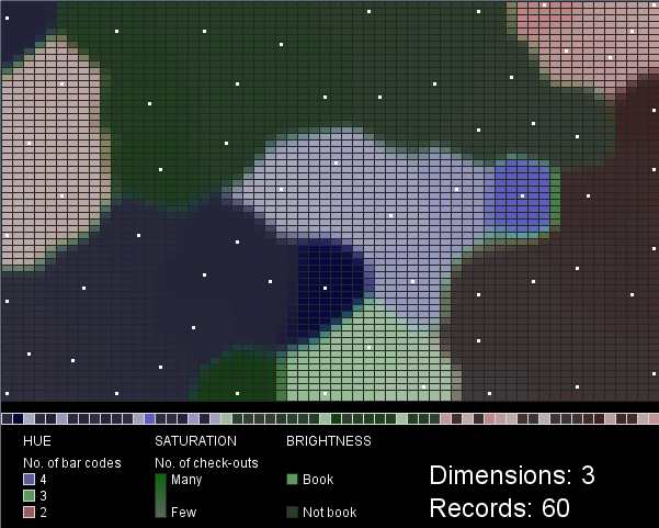
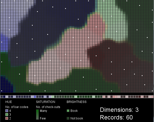
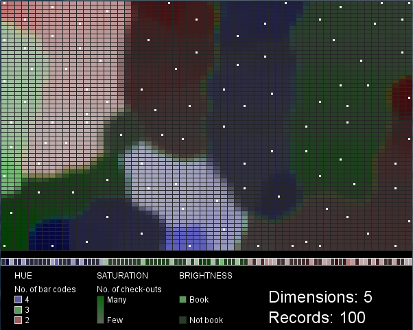
I chose hue, saturation and value as the visual variables to represent three of the five data variables (number of bar codes, number of check-outs, and book/not book). Hue and brightness vary in distinct steps: three hues represent the three classes of items with 2, 3, or 4 barcodes, while the two brightness values represent either “book” or “not book”. Saturation, in contrast, varies along a gradient, corresponding to the range in check-out frequency for the items.
Each box in the row along the bottom of the map (above the legend) represents a single record (library item). They are grouped so that items with 4 bar codes (purple) appear on the left, then items with 3 bar codes (green), then items with 2 bar codes (red) are on the right. Within these groupings the values of the other two variables are mixed. The white dots in the SOM mark the cells that best match each input data record.
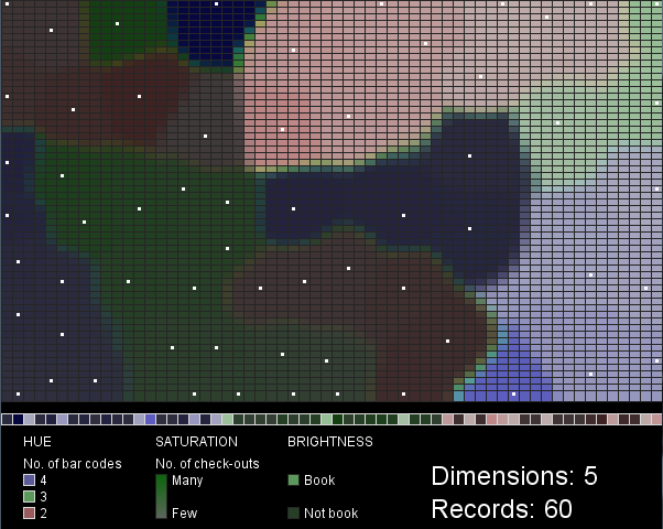
Figures 1 and 2 were created with 3-dimensional input data, 60 records. Figures 3 and 4 were created with 5-dimensional input data, 60 (Fig. 3) or 100 (Fig. 4) records. Scaling the saturation and brightness to illustrate differences in the data was a challenge. I find the two difficult to distinguish at a glance, especially when brightness is low. The mapping of data values to saturation and brightness values could be improved beyond what I’ve done here.
These maps are not very intuitive or useful in their current form. I can’t draw any conclusions about the SPL data, since my visualization represents such a tiny sample of arbitrarily selected data. The project does demonstrate, however, an interesting technique (SOM) with many possible configurations that each lead to different visualization outcomes. A larger SOM that considered many more variables and many more data records might be more enlightening.
Code