2D Spatial Map
MAT 259, 2013
Saeed Mahani
Introduction
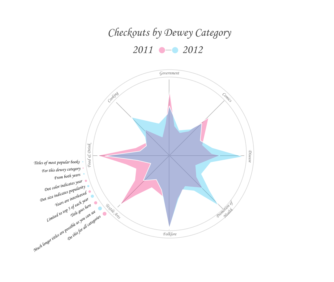
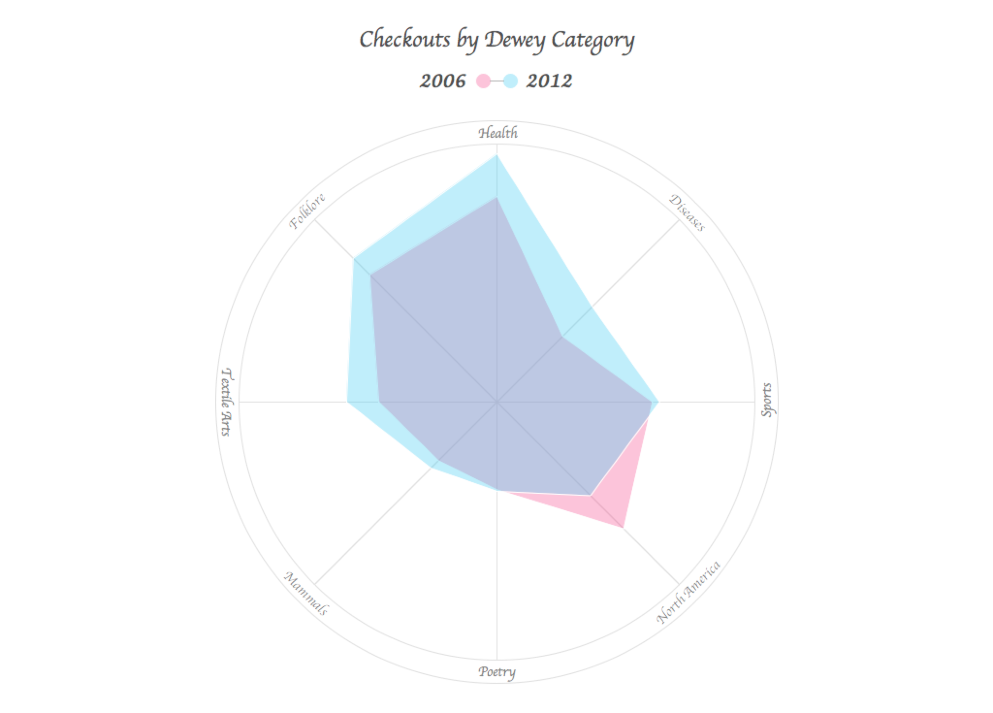
I was curious to see how the current most popular dewey categories ranked 6 years back.
Background
and Sketches
and Sketches
Query
select
year(activity.o) as 'Year',
sum(case when (dewey.dewey = 811) then 1 else 0 end) as '811 Poetry',
sum(case when (dewey.dewey = 599) then 1 else 0 end) as '599 Food & Drink',
sum(case when (dewey.dewey = 746) then 1 else 0 end) as '746 Textile Arts',
sum(case when (dewey.dewey = 398) then 1 else 0 end) as '398 Folklore',
sum(case when (dewey.dewey = 613) then 1 else 0 end) as '613 Health',
sum(case when (dewey.dewey = 616) then 1 else 0 end) as '616 Diseases',
sum(case when (dewey.dewey = 796) then 1 else 0 end) as '796 Sports',
sum(case when (dewey.dewey = 917) then 1 else 0 end) as '917 North America',
from
dewey, activity
where
dewey.bib = activity.bib and
dewey.dewey in (811, 599, 746, 398, 613, 616, 796, 917, 5) and
year(activity.o) in (2006, 2012)
group by year(activity.o);
Query Explanation
Each of the chosen dewey categories is queried, and the checkout occurrences are tallied with the 'sum' SQL function, then grouped by year.
Results and Analysis
Since I wanted to visualize the counts from both years simultaneously, and both years had data for the same categories, I thought a 'web graph' was perfect. These graphs are typically used for displaying personality traits, each axis being a different personality. Here each axis represents one of the preselected dewey categories, and by making the polygonal shape that stretches across the axes translucent, both years are visible. I considered including data from the years in between, but this method broke down with any additional translucent layers as the colors could no longer be differentiated from the graph.
Code