2D Spatial Map
MAT 259, 2012
Yoon Chung Han
Introduction
Seattle is a city rich in a music history supporting a thriving industry that is renowned nationally and globally. In this project, I will explore how much Seattle people love a classical music and how many items related to the best 13 classical musicians they checked out from 2005 to 2010 at SPL.
Here's a list of the best 13 Classical musicians.
- Handel
- Beethoven
- Tchaikovsky
- Chopin
- Mozart
- Schoenberg
- Haydn
- Stravinsky
- Schumann
- Brahms
- Schubert
- Bach
- Debussy
- Handel
- Beethoven
- Tchaikovsky
- Chopin
- Mozart
- Schoenberg
- Haydn
- Stravinsky
- Schumann
- Brahms
- Schubert
- Bach
- Debussy
Background
and Sketches
and Sketches
In a visualization graph, left side will show the visualization of data of checked out items each year and months. On the right side, there will be a list of 13 musicians vertically, and each musician's data can be explored by clicking a small checkbox. Each musician will be determined by different colors as a line, and users can select which musician they want to see or compare with other musicians. X axis in the graph will represent time(months and years), and Y axis will represent the number of checked-out items. In the X, Y cross position, there will be a small square with a given color based on musician's name, and the square will be connected together with a light line. There will be a smooth animation that delivers a feeling of music equalizer.
Query
select count(*), year(ckinDateTime),
SUM(CASE WHEN year(ckinDateTime) = '2005' THEN 1 ELSE 0 END) as yr2005,
SUM(CASE WHEN year(ckinDateTime) = '2006' THEN 1 ELSE 0 END) as yr2006,
SUM(CASE WHEN year(ckinDateTime) = '2007' THEN 1 ELSE 0 END) as yr2007,
SUM(CASE WHEN year(ckinDateTime) = '2008' THEN 1 ELSE 0 END) as yr2008,
SUM(CASE WHEN year(ckinDateTime) = '2009' THEN 1 ELSE 0 END) as yr2009,
SUM(CASE WHEN year(ckinDateTime) = '2010' THEN 1 ELSE 0 END) as yr2010
from transactionsallID where deweyClass is not null and title like "%beethoven%" group by year(ckinDateTime) order by year(ckinDateTime) DESC;
Result and
Analysis
Analysis
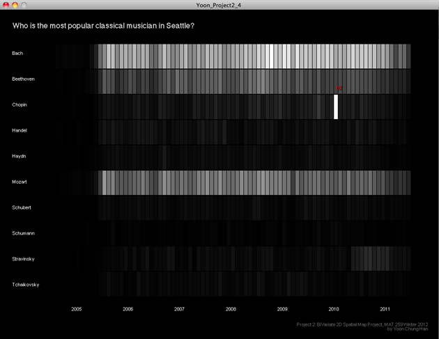
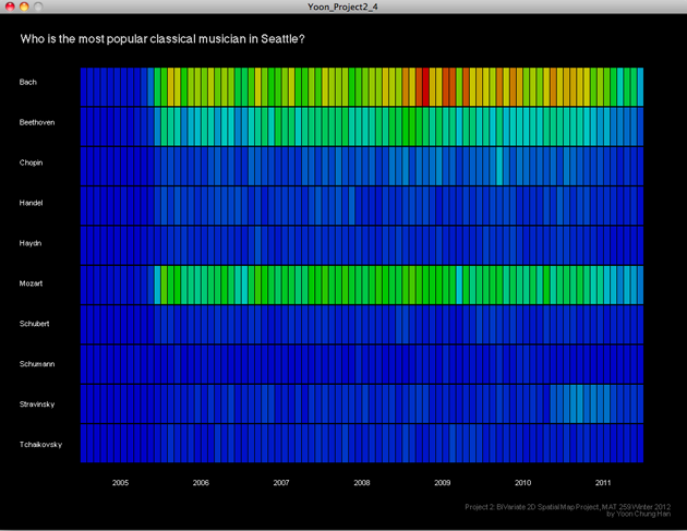
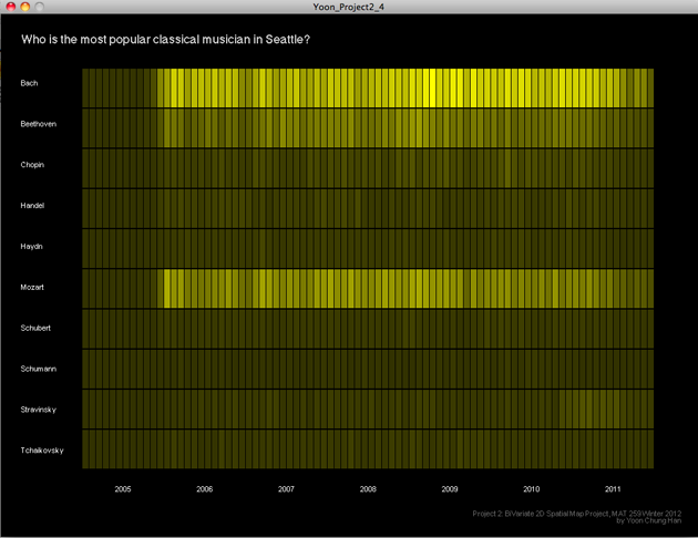
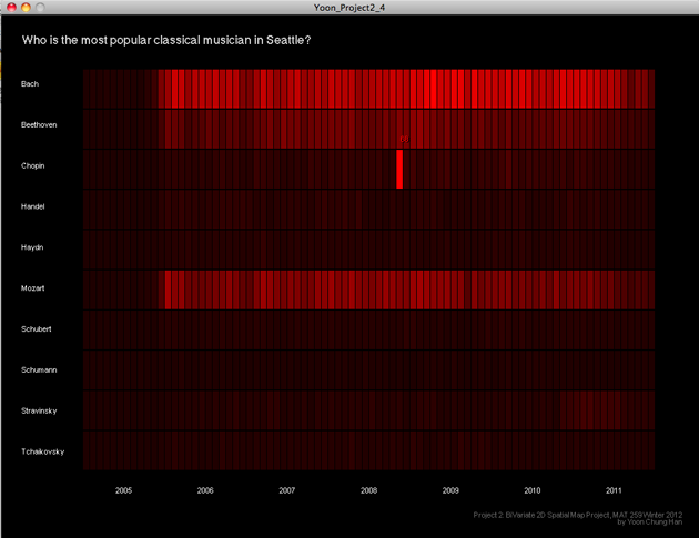
In this visualization graph, 10 musicians is listed vertically on y axis, and every months from 2005 to 2011 are listed on x axis. Basically, it's a bar graph, but the number of checked out items related to each musician is expressed by changes of color and color brightness. There are 4 color themes: black/white, HSB, yellow, red. Users can change the color theme by pressing keys and see the query results easily and intuitively with the color depth. If users roll over mouse on each bar, the number of checked out items per month is appeared. The sliding animation delivers a enjoyable feeling when navigating each color theme.
Code